Flybussen

Flybussen is one of the larges transport operators to and from airports in Norway, consisting of NOR-WAY, Tide, Nettbuss, Boreal and Norgesbuss, which are strong brands with great local presence.

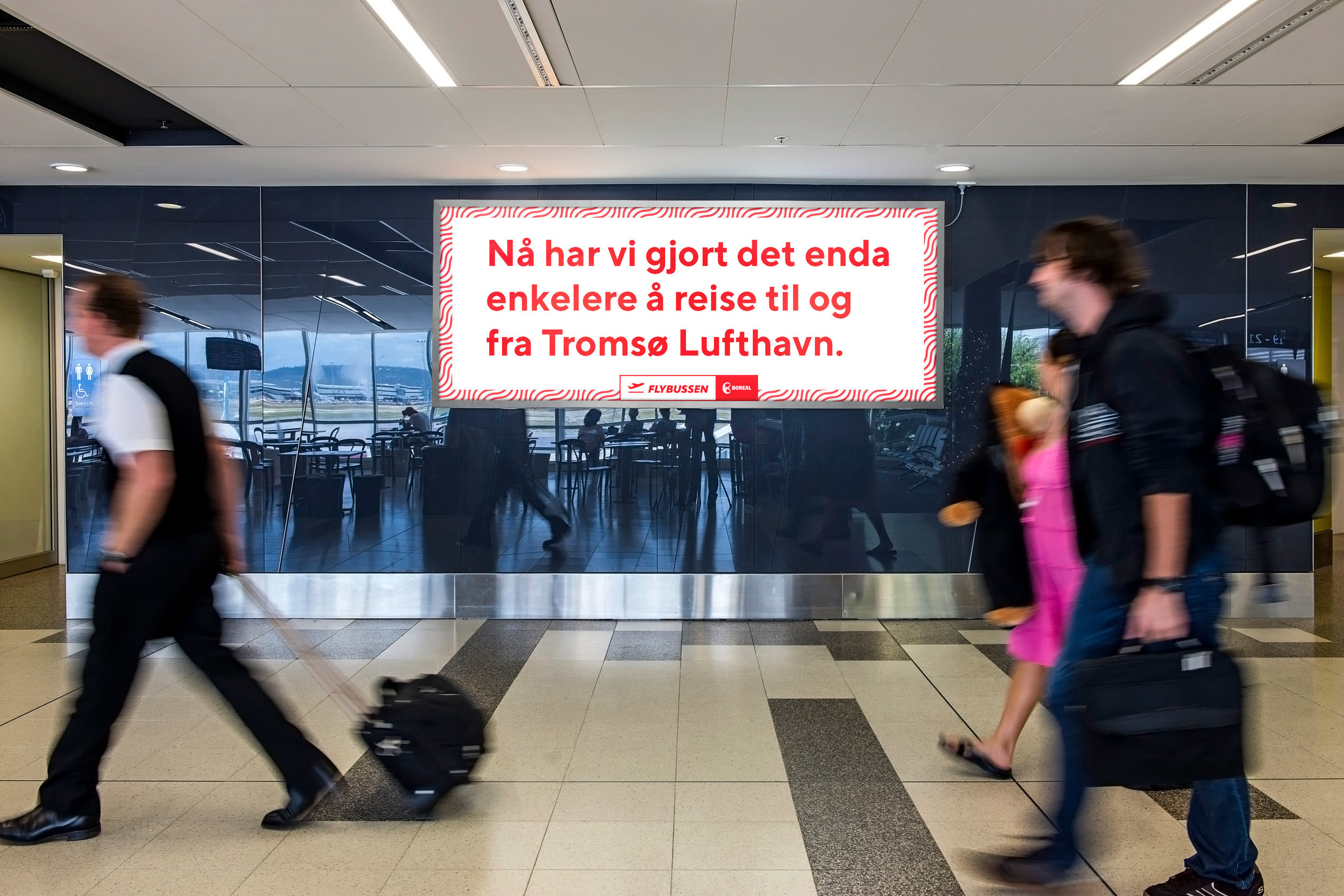
The visual identity is based on an overall design language with a uniform system that is flexible and facilitates differentiation of each operator, so that Flybussen national and each operator have the same visual identity, yet the operator uses one of the main colors from their existing visual identity. This allows one to distinguish one operator from another and strengthens the overall recognisability. Flybussen's national visual profile is used when their communication regards all operators, for example on their website or during nationwide campaigns.

The pattern is the main element of the visual identity and symbolizes the landscape that can be seen both on the journey to and from the airport, as well as from the airplane window. The patterns improve visibility which allows for easier identification of the bus at the airport and on the road.


Project done at Dinamo in team with Alexandra Schou Salbu, Annie Myhre and Marius Nilsen. Video and pictures of buses by Flybussen NOR-WAY.